
What's new in Tally
June 14 – June 20, 2026
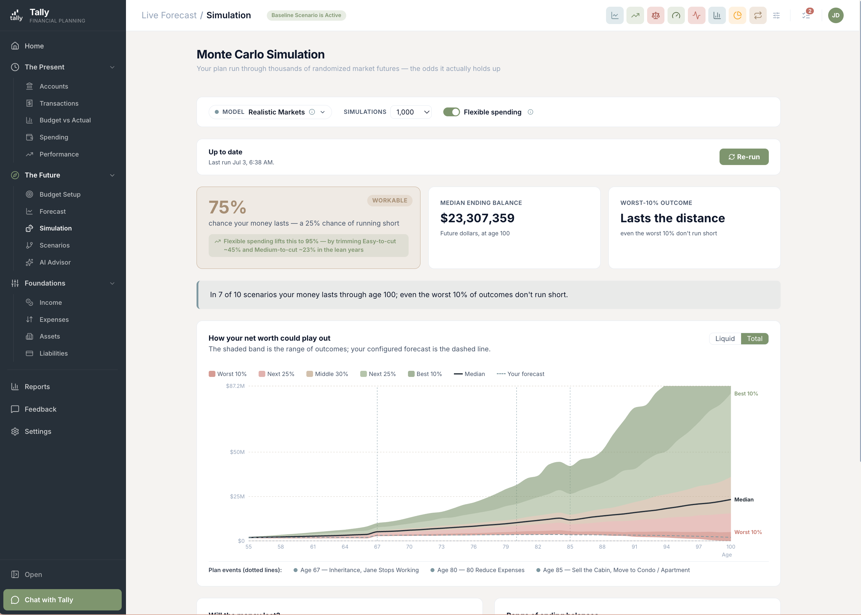
The big one this time: Monte Carlo simulations. Your forecast draws a single line into the future, but real markets don’t move in a straight line. The new Simulation page replays your plan across thousands of possible market histories — good runs, bad runs, and crashes — and tells you, plainly, the odds your money lasts. There’s a fan chart of where you could end up, a survival curve showing when things could get tight, a side-by-side scenario comparison, and a plain-English read on what’s driving your number and how to harden it. The market assumptions behind it are built on real, verified history going back to 1928.
Will your money last? Now you can run the odds
The new Simulation page takes your forecast and replays it across thousands of possible market futures — strong decades, lost decades, crashes early, crashes late. Instead of one tidy line, you get a probability: the share of those futures where your money makes it. The headline leads with the honest number — the odds before any belt-tightening — and then shows how much pulling back on discretionary spending would lift it.
- The honest headline first. "X% chance your money lasts — a Y% chance of running short," before any spending cuts are assumed.
- What flexibility buys you. A secondary line shows how far trimming discretionary spending would lift your odds — and roughly how big a cut that takes.
- A fan chart you can read. Five outcome bands — worst 10%, median, best 10% and the range in between — graded from caution to confidence, clipped so one lucky outlier can’t squash the chart.
- Your plan’s events, marked. Retirement, a home sale, Social Security starting — each shows up as a dotted line on the chart so the step changes read as intentional.
See when the money could run short
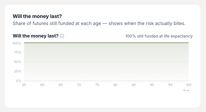
A single percentage answers "will it last?" — but not "when might it get tight?" The survival curve fills that in: it plots, for each age, the share of simulated futures where you still have money. A gentle slope means you’re in good shape deep into retirement; a curve that drops off in your eighties tells you exactly where the risk lives.
- Risk by age, not just a single number. See the odds your money is still there at 75, 85, 95.
- Spot the danger window. Where the curve bends is where a bad market run would hurt most.
- Shortfalls shown as a funding gap. When a plan runs short, Tally shows the cumulative gap you’d need to cover — not a misleading "negative balance."
See the full range of where you could land
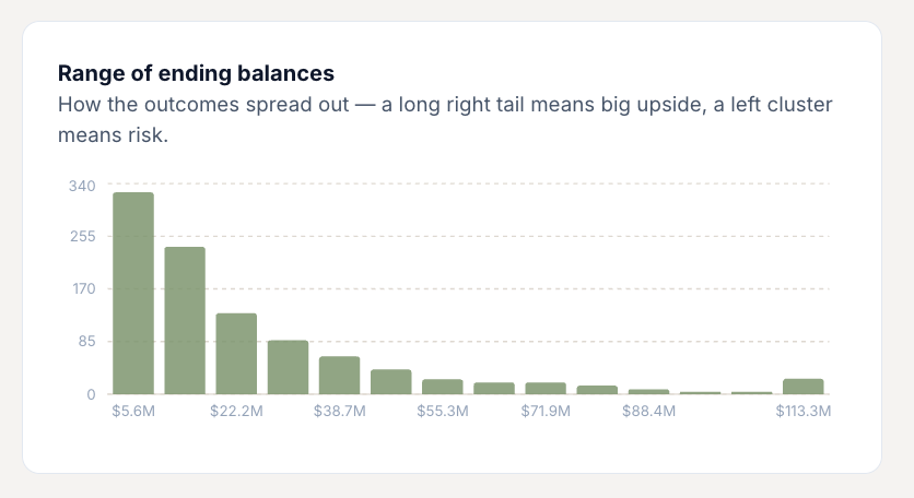
The odds tell you whether your plan holds; this tells you how wide the outcomes really are. Each bar groups the futures that ended around the same net worth, so you can see the shape of your luck — a long tail stretching to the right means real upside if markets cooperate, while a cluster bunched on the left is a sign the plan is leaning on things going well.
- The spread, not just the average. See how far apart the good and bad futures end up, instead of one blended number.
- Upside vs. risk at a glance. A long right tail is big potential; a left-heavy cluster flags where the plan is fragile.
- No single outlier distortion. The extremes are trimmed so one freak result can’t stretch the whole chart out of shape.
Choose how the markets behave
There’s no single "right" guess about the next thirty years, so Tally lets you pick the lens. Four return models stand behind the simulation, from cautious to historical — and a Custom option if you want to set your own. Switch between them and watch your odds move, so you can see how much your plan leans on optimistic assumptions.
- Institutional Forward. Forward-looking return estimates of the kind big institutions plan around — typically more conservative than the long-run past.
- Realistic Markets. Calibrated to the real long-run record, with the booms and busts that come with it.
- Historical Replay. Replays actual market history — the Depression, the 1970s, 2008 — in real sequences, not smoothed averages.
- Custom. Set your own expected returns and volatility when you want to test a specific view.
A plain-English read on your odds
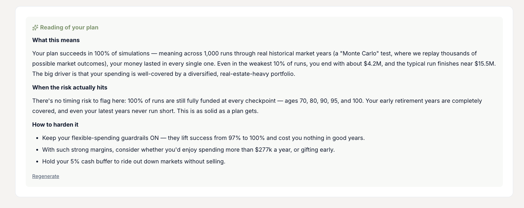
Numbers and charts are only half the story. Alongside the results, Tally writes a short, plain-English read on what your simulation is telling you — why your odds land where they do, where the low point in a rough run tends to fall, and the handful of moves that would most improve your chances.
- Why your number is your number. The main forces pushing your odds up or down, in a sentence or two.
- Where the low point lands. In the rough futures, when money tends to get tightest.
- How to harden the plan. Concrete levers — saving more, retiring later, trimming spending — ranked by impact.
Compare two plans side by side
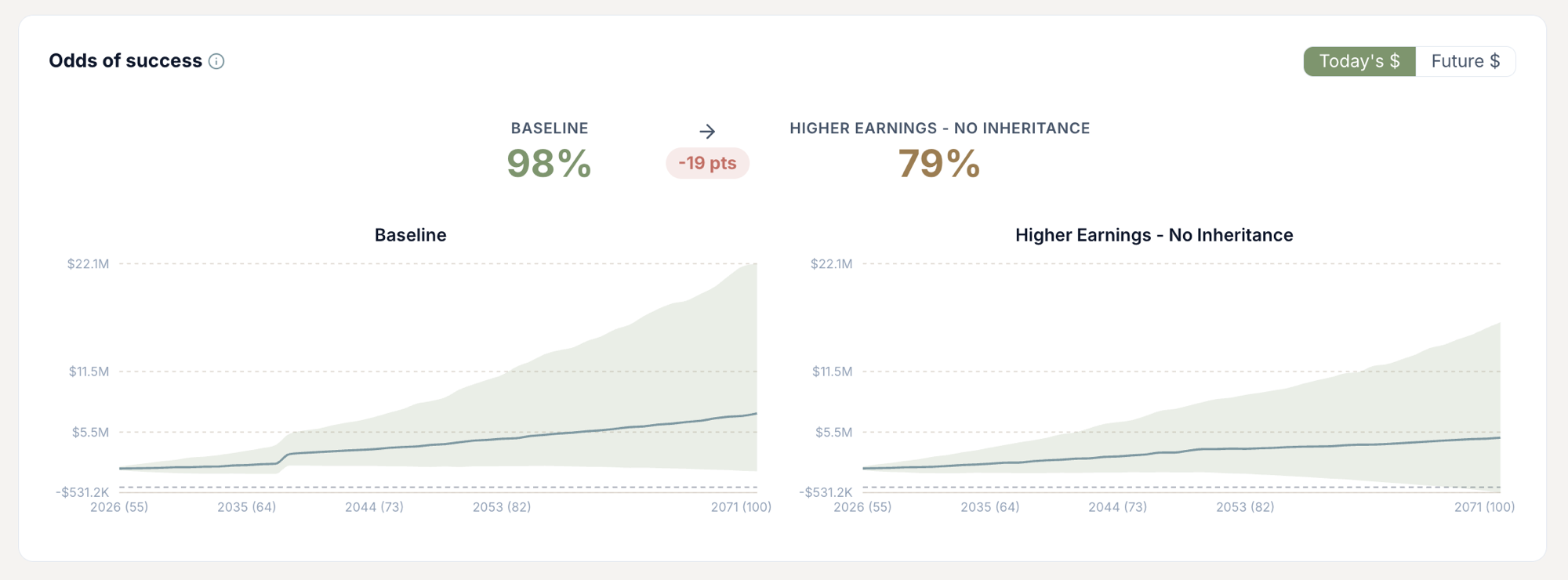
Wondering whether retiring two years earlier, or saving a little more, is worth it? Run two scenarios and see their fan charts next to each other, with the difference in your odds of success called out — so the trade-off is a number, not a hunch.
- Two fan charts, one view. The full range of outcomes for each plan, lined up to compare at a glance.
- The success delta, spelled out. How many points one plan beats the other by, so the choice is clear.
- Right where you build scenarios. It lives on the Life Events page — pick any scenario other than your baseline and the comparison appears.
Built on real history, and honest about the odds
A simulation is only as trustworthy as the assumptions under it. Tally’s markets are built from a verified record of stock, bond, cash, and inflation returns going back to 1928, and the methodology is deliberately honest rather than flattering. The goal is a forecast you can act on, not one that just feels good.
- Verified data back to 1928. Returns and inflation come from an authoritative long-run dataset, with built-in checks that the numbers match the historical record before they’re ever used.
- Stagflation is in the picture. High-inflation years drag stock and bond returns down together rather than treating them as independent, so the worst-case tail reflects how bad markets actually behave.
- No hidden pessimism — or optimism. The typical simulated path lines up with the forecast it’s built on, so the odds aren’t quietly tilted one way or the other.
- The cost of "success" is shown, not hidden. When the plan only survives by cutting back, Tally surfaces how deep that cut had to go — your must-have expenses are never trimmed to manufacture a better-looking number.
Run your first simulation
Sign in, open Forecast → Simulation, and see the odds your money lasts across thousands of possible futures. Try switching return models to see how much your plan leans on the markets being kind.