
What's new in Tally
May 28 – June 13, 2026
This is a big one. There’s a brand-new Accounts page that puts every connected account — and how each one has moved — in a single view. Net Worth History is fully redesigned, the Home page is rebuilt around a present-to-future story, and getting set up is now a guided conversation. A new Year-End Outlook tells you whether you’re on track to hit the net worth your forecast predicts. And under the hood, connecting a bank feed to an account you’ve already imported no longer creates duplicate transactions.
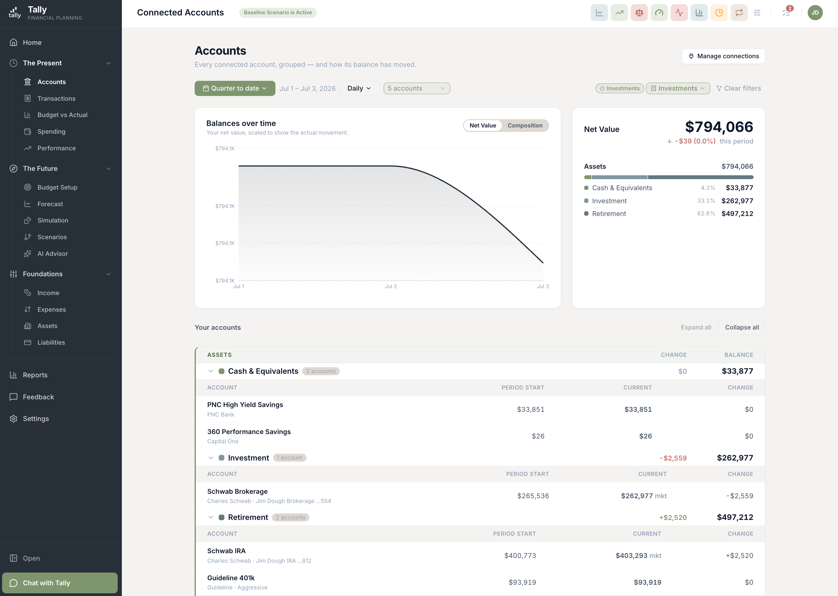
Every account, in one place
The new Accounts page lists every account you’ve connected — assets and liabilities, grouped the same way as the rest of Tally — and shows what each one started at, what it’s worth now, and how it changed over the period you pick. A chart builds the picture up account by account, and clicking any account slides in a drawer with its own balance trend and the transactions behind it.
- Assets and liabilities, side by side. Each grouped into the same categories you already use, with change and balance lined up column by column.
- Filter to the accounts you care about. A multi-select account filter scopes the whole page — chart, totals, and breakdown.
- Saved views follow you. Save a date range, chart style, and account filter once and it’s there on every device you sign in from.
- Per-account detail in a drawer. Click an account for its own balance-over-time chart and the transactions that moved it.
Net Worth History, redesigned
Net Worth History got a cleaner, more useful look. A dark hero card leads with your net worth and the gain over the window you’re viewing. The trend chart auto-scales to your actual range instead of always starting at zero, so real movement is visible. And two new cards — Composition and Top Movers — show what you own versus owe and which accounts moved the needle most.
- A trend you can actually read. The chart zooms to your data’s range instead of flattening every move against a $0 baseline.
- Top Movers. See which assets and liabilities changed the most over the window, at a glance.
- Composition. Own-versus-owe bars by category, always visible, sharing one scale so big debts render honestly.
- Month-over-month detail. The period breakdown now shows each line’s change versus the prior period, color-coded.
A new Home, and simpler navigation
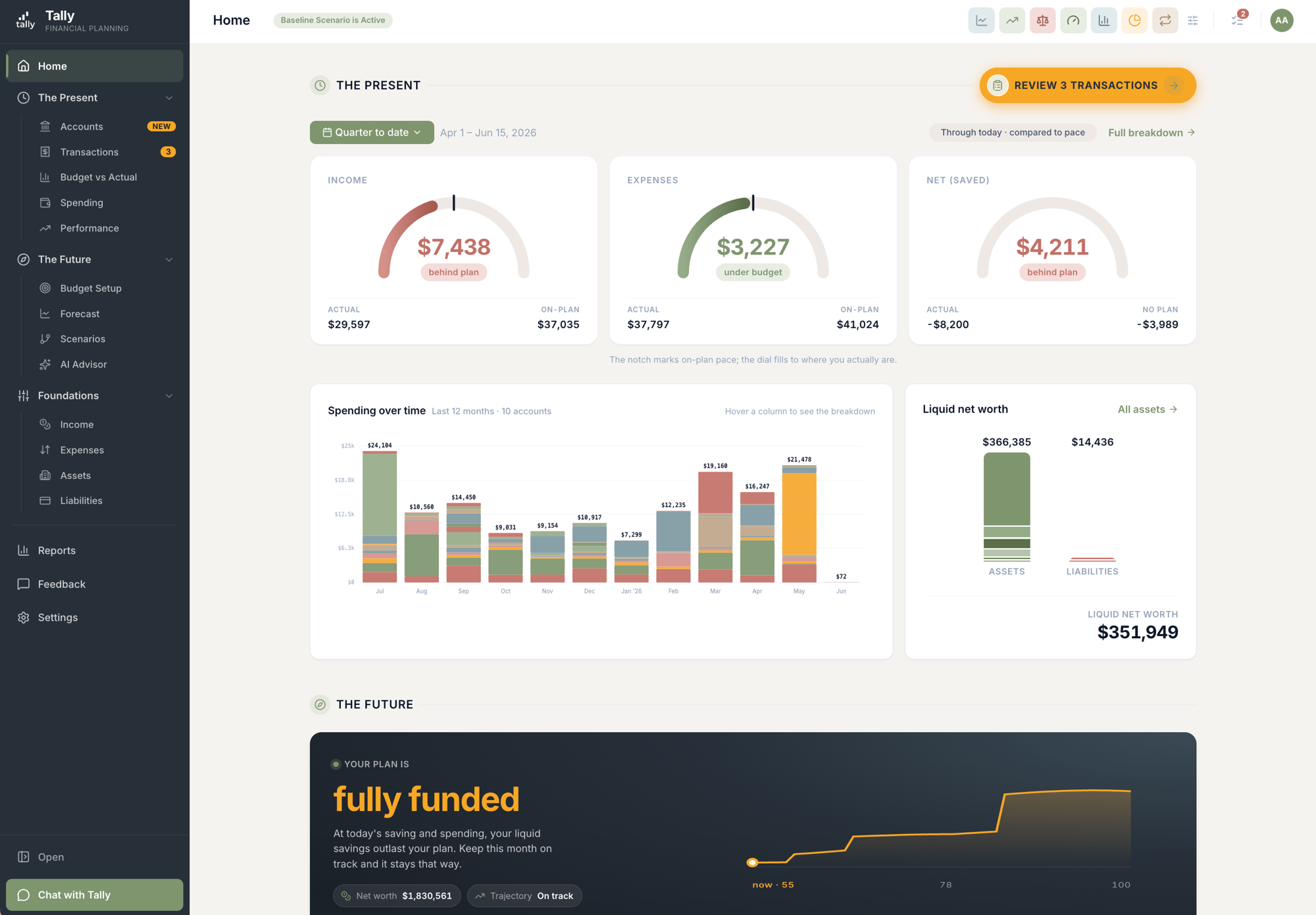
The Home page is rebuilt around one story: your present, then your future. The top half is today — how this month’s spending is pacing, where your money’s going over time, and your liquid position as two clean stacked bars. The bottom half is your forecast and the new Year-End Outlook. New here? Setup cards walk you through getting each part ready and check themselves off as your data arrives.
- Present → Future, top to bottom. Today’s numbers lead; your forecast and year-end outlook follow.
- Spending over time. A stacked monthly chart — the same one from the Expense Report — right on your Home page.
- Liquid position at a glance. Two stacked bars — assets versus liabilities — with your liquid net worth called out, reconciling exactly with your forecast.
- Setup cards that guide you. Each step clears itself as your transactions, budget, and forecast come together.
Year-End Outlook: are you on track?
A new card on your Home page and a full report answer one question: based on what’s happened so far this year plus what’s scheduled for the rest of it, are you on track to hit the net worth your forecast says you’ll reach by December? It splits the story into the saving you’re doing and the market growth on your investments, so you can see which one is ahead or behind.
- Goal, projected, and the gap. Your forecast’s own year-end number is the goal; the gap is purely how your year is running ahead of or behind it.
- Saving vs. market growth. The outlook separates what you’re putting away from what the markets are doing.
- The card and the report always agree. Both read from the same numbers, so the figure on Home matches the report exactly.
Getting set up is now a guided conversation
Onboarding is rebuilt as a friendly chat with real buttons at each step. Connecting accounts happens in a clean side drawer with an "I’m done connecting" gate, and a live checklist shows each sync as it runs. Tell Tally your home’s address and it looks up the value for you. Your starter budget gets seeded automatically. Less typing, fewer dead ends.
- Connect in a side drawer. Link as many accounts as you like; the syncs gather into one summary instead of closing the panel each time.
- Your home, valued automatically. Give an address and Tally fetches the estimated value, then lets you attach the mortgage to that home.
- A budget to start from. Your first budget is seeded for you instead of starting blank.
- Buttons, not guesswork. The chat offers real actions — Connect accounts, I’ll type it in, Proceed to Tally — right where you need them.
Asset Performance you can check yourself
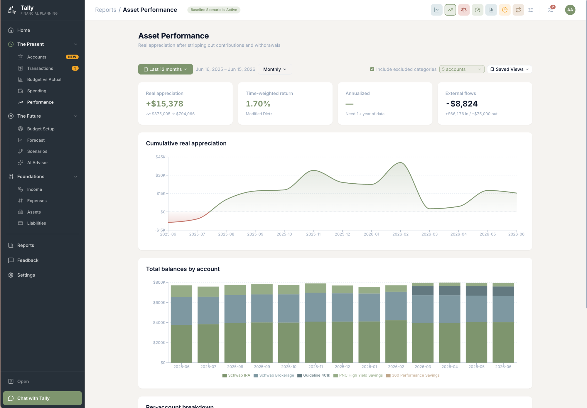
Asset Performance got more depth and more trust. A new stacked chart shows total balances by account over time. Click any account for a reconciliation drawer that walks the math — where you started, money in and out, market movement, where you ended — and tells you whether it ties out. And the engine now tells a security moving between accounts apart from real money coming in or going out, so your returns aren’t thrown off by internal moves.
- Balances by account, over time. A stacked chart under the returns chart shows how each account’s balance built up.
- A reconciliation drawer that shows its work. Start → money in/out → market movement → end, with a tie-out verdict and the transactions behind it.
- Real moves vs. internal shuffles. Shares transferred between your own accounts no longer count as a contribution or withdrawal.
- Saved views, real account names. Save a view like everywhere else, and every account shows its actual name instead of a generic label.
No more double-counted transactions
One of the trickiest ways numbers go wrong: you import a year of history from a spreadsheet, then connect a live bank feed — and the overlap gets counted twice. We rebuilt how Tally handles this so a single account is fed by a single source, and the live feed picks up exactly where your import left off. If anything ever slips through, there’s a review step so nothing is hidden silently.
- One live feed per account. Pointing a second bank or brokerage feed at an account that already has one now warns you instead of silently switching it.
- Feeds don’t backfill over your import. When you connect a feed to an account with imported history, the feed starts after that history — it won’t re-import the same period.
- Imports fill only the gap. A spreadsheet import into a live-connected account only adds the older history the feed can’t reach.
- A safety net, never silent. If a duplicate ever slips past, it’s flagged for you to hide or dismiss — Tally never quietly deletes one.
More improvements
Bigger upgrades that didn’t need their own headline.
Budget is now one page with a view toggle
The classic spreadsheet and the newer card layout are merged into a single Budget page with a Table View / Spreadsheet View switch — pick whichever you like and it sticks. Both views now open the same Category Hub drawer when you click a row.
The Category Hub ties Income/Expense, Budget, and Forecast together
Click a category — from the Budget page or your Income/Expense lists — and a slide-in panel shows the items feeding it, your budget for the year, and a one-click "Match forecast" that pushes the category’s forecast total straight into the budget line. Three views that used to live apart, now in one place.
The Subscriptions Report catches a lot more real bills
A mortgage that your servicer splits into principal, escrow, and a fee on the same day now shows as one line instead of vanishing. Bills whose amount drifts (insurance re-rates, cable creep) are caught on their monthly/quarterly/annual rhythm. A subscription that moved to a new card is stitched into one row. Card payments are excluded. Groceries and gas still can’t sneak in.
Live progress while a connection syncs
Connecting a bank or brokerage used to be a spinner that could sit there for minutes. Now you see a live checklist — which step it’s on and how many transactions it has pulled and categorized — in both onboarding and Settings → Connections. You can also close the panel and let it finish in the background.
Add a new bank account without disconnecting
Opened a new account at a bank you’ve already connected? Tally now notices, nudges you with a "New Accounts" badge, and lets you grant access to just the new account — no disconnect-and-reconnect, and your history stays put.
Paycheck deductions are classified properly
Each deduction on a paystub is now treated as a tax, an expense, or a transfer into a linked account — as a percentage of gross or a fixed dollar amount, with the Social Security wage cap respected. That fixes a forecast quirk where net income was overstated and 401(k)-style contributions could be counted twice.
Loan balances you set now stick
A balance you enter on a loan stays put, and month-end snapshots are recorded so your net worth history for that debt is accurate over time instead of resetting.
The Expense Report drill-down is easier to navigate
Drilling into a month now shows the year, lets you click a month to filter the list to it, and paginates long transaction lists so the page stays quick.
Quick Reports are grouped and faster to scan
The Quick Reports picker now groups reports by data type, swaps the slow native tooltip for an instant one, and lets you click a name to open the report or use the checkbox to pin it.
The Reports index is organized by type
Reports are now grouped by what they’re about — spending, net worth, performance, and so on — so the one you want is easier to find. Budget Setup is surfaced first in the navigation.
Fixes
Small things that were wrong. Now they're right.
- Connecting a live feed onto an account that already has imported history no longer creates duplicate transactions — the feed picks up exactly where your import left off, and one-time imports only fill the gap the feed can’t reach.
- A single duplicate-detection hiccup during a Plaid sync no longer crashes the whole batch — the rest of your transactions still come in.
- Reset All Data no longer fails when you have incomes or expenses tied to a life event.
- Month-end jobs (snapshots, summaries) now run and stamp their dates in Eastern time instead of UTC, so a month closes when your calendar says it does.
- The monthly summary email now respects categories you’ve hidden from reporting and reports the net-worth change for the right month.
- Connections only alert you on a real error now — a brokerage being briefly slow to refresh no longer looks like something broke.
- During onboarding, your home’s mortgage is linked to the home instead of being created twice, and a few category mix-ups in the guided setup are fixed.
- The "needs review" pill in the navigation keeps its count fresh instead of showing a number that was right only when the page first loaded.
- The daily email’s "Budget Alerts" section is renamed to the clearer "Categories Over Your Monthly Budget."
- On the Accounts page, the change amount and the account-count badge no longer overlap on a phone.
- Daily-detail charts are capped at 90 days and switch off an invalid daily interval automatically on longer ranges, with a clear loading state while a report builds.
- The assistant’s confirmation cards show a plain year and resolve names before displaying, so they read cleanly.
Open the new Accounts page
Sign in and check out Accounts in the sidebar — every account you’ve connected, grouped and charted, with a drawer for each one. Then peek at your Home page for the new Year-End Outlook.