
What's new in Tally
July 29 – August 23, 2026
The last release was about changing your plan on purpose. This one is about understanding what’s acting on it — the forces behind the numbers you already watch. A new report shows the inflation rate you’re actually living, not the headline one, with credit for the costs you’ve already locked in. Another lets you pick a single category and see everything about it — where it’s trending, who you’re paying, and how much of a rise is prices versus your own habits. When you compare two plans, Tally now lays out exactly what’s different between them, line by line. And if you draw from retirement accounts, those withdrawals now show up as income you can budget and track.
The inflation rate you’re actually living
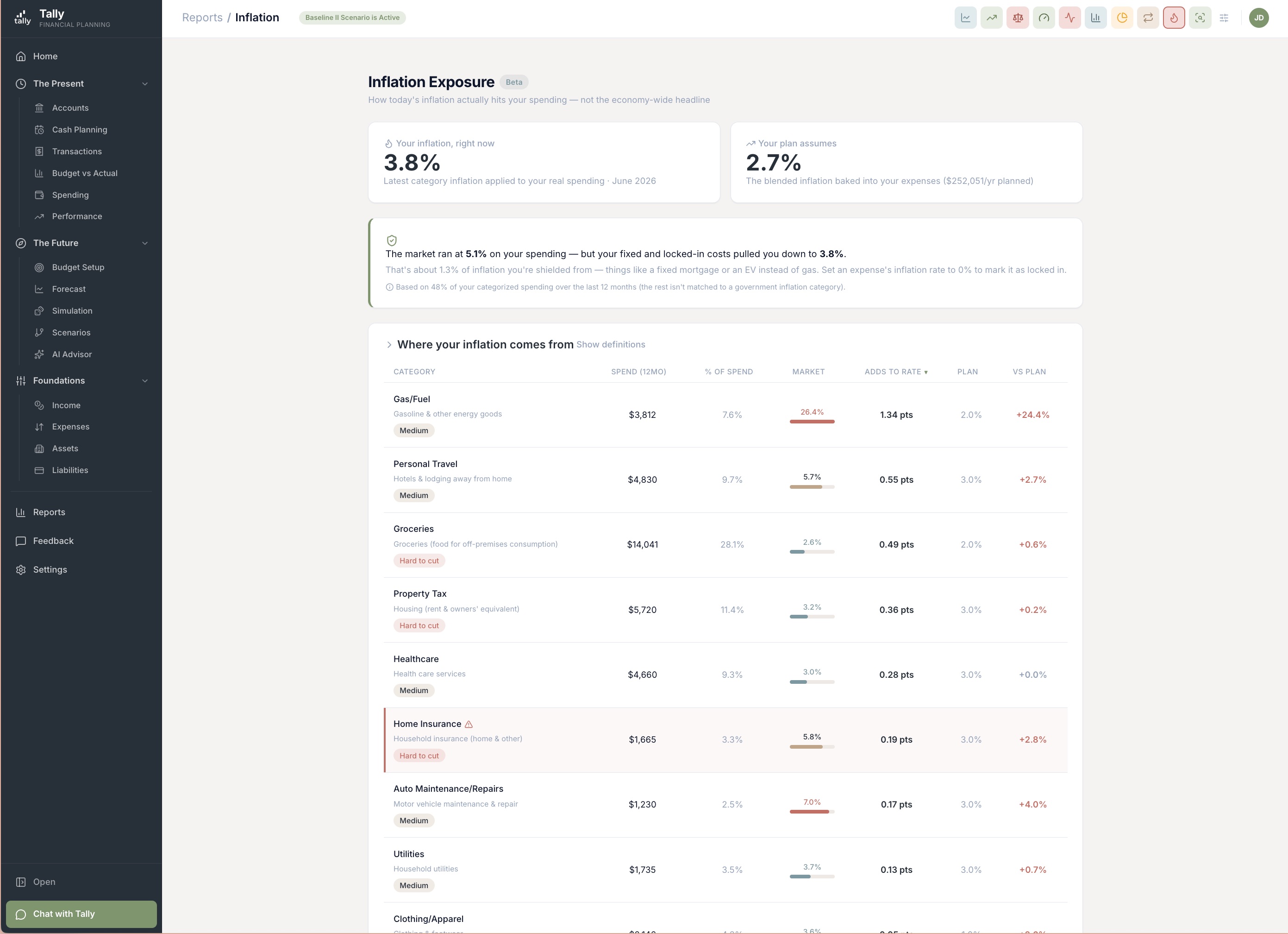
The inflation number in the news is an average of everyone’s spending. Yours isn’t everyone’s. The new Inflation Exposure report takes the government’s category-by-category inflation and applies it to your real spending over the last year — then turns it down for the costs you’ve already locked in. The result is one honest number: the rate you’re feeling right now, next to the rate your plan is built on.
- Your rate vs. what your plan assumes. One headline figure — the inflation you’re living with today — sits beside the rate your forecast quietly runs on, so you can see at a glance whether your plan is keeping up with your real life.
- Credit for what you’ve locked in. A fixed mortgage doesn’t reprice. An EV you charge at home barely feels the price of gas. The report turns your rate down for the costs you’ve shielded, instead of charging you the market average on money that isn’t exposed to it.
- Where it’s coming from. A category-by-category table shows each part of your spending’s own inflation rate, how it compares to your plan, and how much it adds to your overall number — with the ones running hot and hard to cut flagged, so you know where the pressure really is.
Everything about one category, in one place
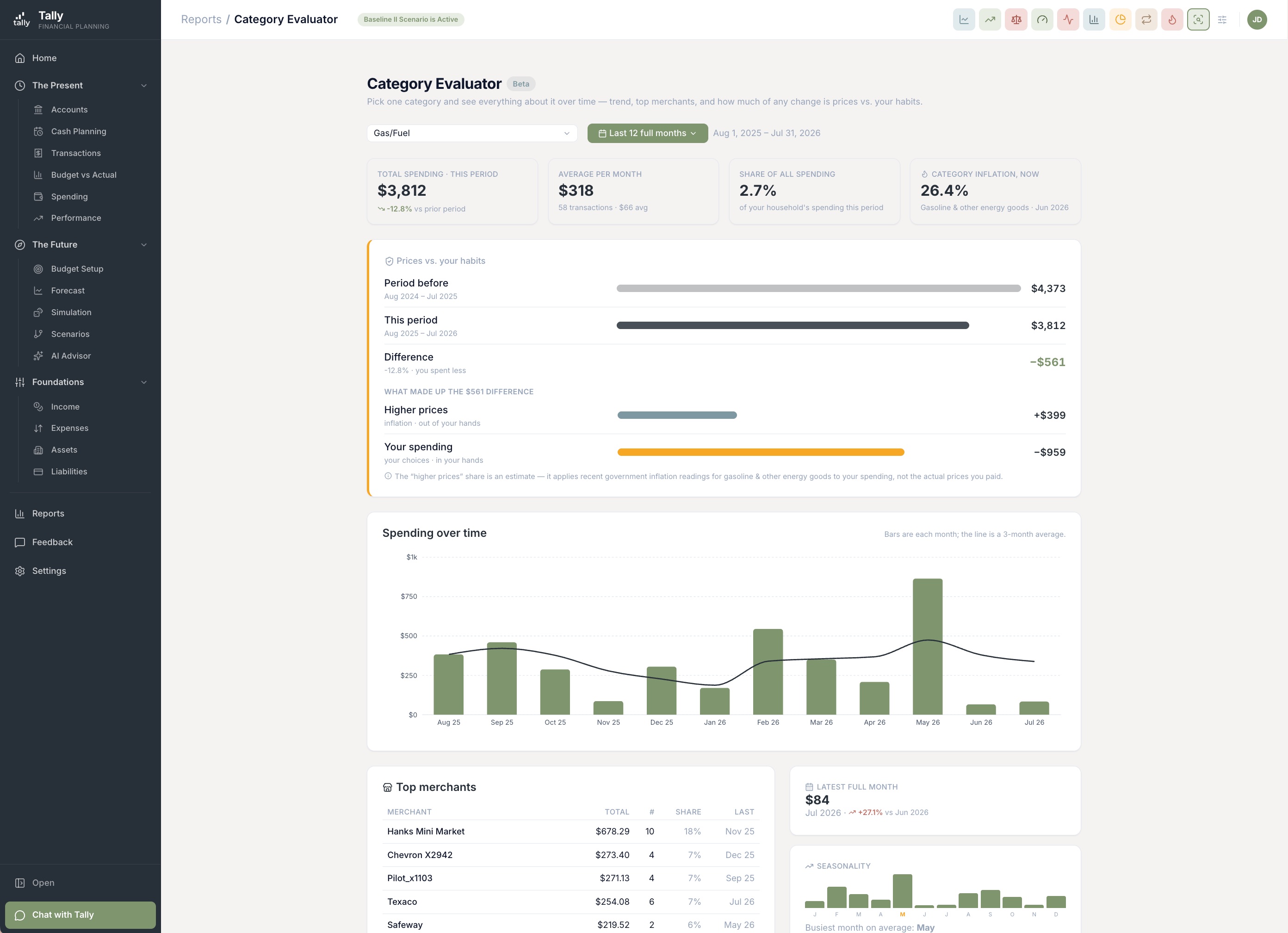
Some months a category jumps and you just want to know why. The new Category Evaluator lets you pick a single one — groceries, dining out, a paycheck — and a stretch of time, and lays out its whole story: how it’s trended month to month, who you paid the most, when it runs heavy, and the answer that’s hardest to get anywhere else — how much of a change is rising prices versus a change in your own habits.
- The trend, month by month. Monthly totals with a trend line drawn across them, plus how this month compares to last and how the category behaves across the seasons.
- Who you’re paying. The top merchants inside the category, so a rise has a name attached to it instead of being a mystery line on the chart.
- Prices vs. your habits. When a category costs more than it used to, Tally splits the change into dollars: this much is prices going up, this much is you buying more or less. Works for income categories too.
- Every transaction, one click away. “See all transactions” opens the same rich drill-in view the Expense Report uses, so you land somewhere familiar from either report.
See exactly what separates two plans
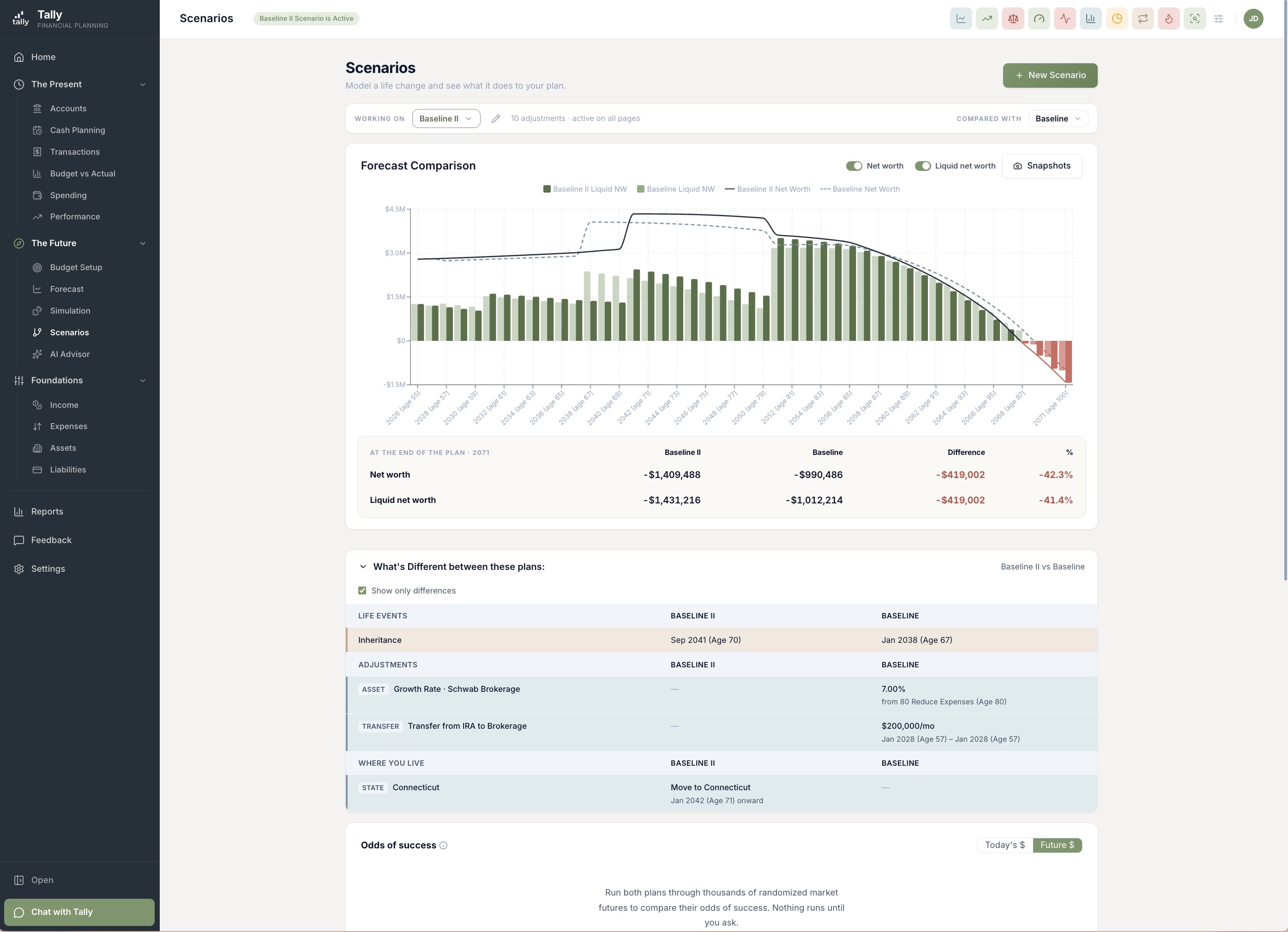
When you compare two versions of your future, the chart shows you the gap in dollars — but not what’s causing it. Now a “What’s different” panel lays the two plans side by side and calls out every place they diverge: the life events and their dates, the things each plan changes about your income, spending, assets, and debts, and any moves between states — with the differences highlighted and everyone’s age shown on every date.
- Every difference, highlighted. Events, overrides, scenario-only additions, state moves — each plan’s version sits next to the other’s, and the rows that actually differ are marked, so you’re not hunting the chart to figure out what changed.
- Down to the detail that matters. Two payoff strategies that differ only in an extra monthly payment now show that difference plainly, instead of reading as identical. The panel compares every meaningful field, so a real difference never hides.
- Show only what’s different. Collapse the panel to just the rows that changed, or open the whole comparison when you want the full accounting.
Retirement withdrawals you can budget and track
When you’re retired, the money you pull from an IRA or 401(k) is income — it’s what you live on. But a withdrawal lands in your checking account looking like a transfer, not a paycheck. Now Tally recognizes it for what it is. Two income categories — Required Minimum Distributions and Retirement Account Withdrawals — let you budget that income and check it against your plan, the same way you would a salary.
- One click to file it. When Tally spots a deposit from a retirement account into your checking, the Transactions page offers to record it as a required distribution or a discretionary withdrawal — no digging through categories to place it.
- Your plan, checked against real life. Your year-end comparison now lights up these categories with what you actually withdrew, next to what the forecast expected — so you can see whether you’re drawing at the pace you planned.
Cash Planning, out of beta and easier to trust
Cash Planning shows the next stretch of your cash — what’s coming in, what’s going out, and whether you dip. It’s out of beta now, and this release makes what it tells you easier to read and easier to correct.
- See — and undo — any amount you pinned. When you pin a bill to a set amount, Cash Planning now shows that a person set it, right next to what it would have calculated on its own, with a one-tap way to remove the pin so the number tracks your balance again. No more wondering why a figure looks stuck.
- Money in and money out read the same everywhere. The “Cash needed” card now signs every line the way the list right below it does — bills and payments as money leaving, deposits as money coming in — and ends on a single “net over the next N days,” with an on-track note when you’ve got room to spare.
- The bill you’re actually about to pay. For a card you pay in full by hand, Cash Planning now lines up the statement that’s genuinely next in line — including the one that’s still open — so what it plans to pay matches what your bank will ask for.
Your recurring bills, caught even when they’re slow
The Subscriptions report finds the charges that repeat — streaming, insurance, the quarterly trash pickup — so nothing recurring slips past you. This release makes it steadier and easier to sort the way you want.
- Slow bills don’t get missed. Narrowing the date range used to hide a quarterly or every-few-months bill, because there weren’t enough charges in the window to recognize the pattern. Now Tally always looks back far enough to catch them, and the range you pick only changes what it shows you.
- Sort it your way, and it stays. Every column sorts now, and the way you sort it follows you from one device to the next.
- What’s hit this month, and what’s left. New totals show what’s already gone out this month and what’s still to come, so a glance tells you where the month stands.
More improvements
Upgrades that didn’t need their own headline.
Net worth, day by day over short spans
Look at a window of a month or less and the net-worth trend now draws a real daily line instead of collapsing to a single dot. A Daily and Weekly zoom sit in the report’s controls.
A “Year to month end” date preset
Checking in mid-month, a full month of income used to be compared against a partial slice of the year, so early paychecks read as over budget. The new preset runs from January 1 through the last day of this month, so income and budget span the same complete period.
Report columns show the dates they mean
The Start and End value columns on Accounts and Performance now carry the actual dates from your filter — “Jan 1, 2026” / “Aug 22, 2026” — so a range that ends in the past never looks like it’s reporting today.
Pull your full history when you connect
Linking a bank, brokerage, or spreadsheet now defaults to “All available” history instead of the last 90 days, so you start with the whole picture.
A cleaner first day for new members
New signups land on the real dashboard right away, with honest empty states until there’s data to show — and the setup chat can be set aside and picked back up exactly where it left off.
Fixes
Small things that were off. Now they’re right.
- The Subscriptions summary now flows to make room for its new monthly totals instead of squeezing everything into four tiles.
- Rolling date ranges now say “full” — “Last 3 full months” — so it’s clear they cover whole calendar months, not a partial stretch.
Open the Inflation Exposure report
Sign in, open Reports, and look at the inflation rate you’re actually living — then see how much of it comes from the categories you can still do something about. It takes a minute, and it’s a number worth knowing.